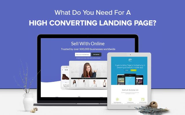
Crafting of a landing page is an effortful process. Dozens of things need to keep in mind and a whole science of psychology hiding underneath the surface starts asking. How should it look? What customers like to see? And why not, landing page initiates a great first impression with your visitors and converts them into lifelong customers.
So, how to make a landing page that generates leads? Well, the answer is there is no standard manual for creating an attractive landing page but yes, if you put up these essential components together then you can make a foolproof design.
Landing pages are not same, each one of us has different customers in mind and different products to offer. There is a huge difference in the audiences to which a landing page is designed, a single rule is not enough to cover every aspect. But there are some things that are common in best leads generation landing pages. Read them below and create your own compelling landing page that will lift your conversions.
Headlines matter a lot
In order to make your landing page more attractive, there must be something that draws people’s attention in. But make sure your title is in focus, it clearly defines your products and not distract the overall intent.
Ways to create an attractive headline
- Start with a question like “How to” and then answer in a subheadline.
- Your headline must not be more than twenty words
- Use humor, it drives people in.
- Clearly defines what your products and services are all about.
Here’s a great lead generation landing page example from HubSpot, they have asked a question in the headline and then answer it below in the subheadline. They clearly define their services in the content and highlighted the important things.
Effective Pictures
Pictures speak more than words, our brain reacts to images 60,000 faster than texts. So pick an effective picture for your landing page.
While selecting pictures, remember:
- The picture should be large.
- Your landing page must have a picture of your product if you are selling a product.
- It must be clear and relevant.
- Pick high-quality picture.
Writing style
Writing style matters a lot especially on a landing page, you must express each point clearly like the benefits of your product to your prospects to turn them into customers.
Keep in mind the following things:
Quantity:
The amount of the content can either make your business or break it. If you write too much, your customer will get bored and return to the search results, on the other hand, if you write less, your prospects may feel uneasy and find you less credible. So, provide all details about your product, but be mindful of the content amount.
Formatting:
Use different formatting styles to make your content more attractive like bullets, numerals list, bold copy, and italics.
Ask what is required
Contact form in landing page must be as simple as possible. For leads, try to avoid stuffing extra fields in contact forms. Don’t ask for age, telephone number or any other confidential information. Try to avoid using “submit button” at the end of the contact form, use “Get your evaluation” or something else.
Build trust
Add credibility to your website, integrating statistical confirmation and customer testimonials.
Statistical confirmations
Statistical pieces of evidence help you convert your visitors into leads. This depicts, you are giving solutions to their problems. And don’t forget to mention the source that is generating the evidence.
Customers’ testimonials or reviews
One of the most effective trust builders is the recommendation of satisfied customers. Mention full name and title of the customers, this will make the testimonials more credible.
Stay tuned to read more interesting topics on technology.


